Creating a website is more than just selecting a template and adding content; it’s a strategic process that requires thoughtful planning and execution. Whether you are building a new website or redesigning an existing one, a clear website design plan (or website blueprint) ensures that the final product is visually appealing, functional, responsive, and optimized for search engines.
In this blog, we discuss what to include in a website design plan so you can deliver a site that aligns with business goals, enhances user experience, and effectively communicates your brand’s message.
What is a website blueprint?
A website blueprint is a detailed website plan or outline that guides the design, development, and structure of a website.
Similar to an architectural blueprint for a building, a website blueprint serves as a roadmap for all the components of a website project. It typically includes:
- Site structure and navigation: How the website’s content is organized, including hierarchy of pages, main sections, and how users will navigate between them.
- Wireframes: High-level visual representations of the website’s layout including where headers, footers, navigation menus, and content blocks will be placed on each page. For smaller websites, you would have the layout for every page. While larger websites, you may decide to build templates for sections.
- Content plan: A breakdown of the types of content that will be included on the site, such as text, images, videos, and downloadable resources. Include your SEO strategy as part of your content plan.
- Technical and functionality specifications: Specifications for the website infrastructure including the CMS (Content Management System), hosting requirements, database needs, and any third-party integrations. Also include descriptions of any interactive features or functionalities, such as forms, e-commerce capabilities, login systems, or multimedia elements.
- Design guidelines: Instructions on the visual style of the website, including color schemes, typography, and branding elements.
- Project timeline and approval: A plan for the development and delivery process, including milestones, deadlines, and responsibilities for different parts of the project.
- Budget and resources: An estimate of the costs involved in the website development process, including design, development, content creation, and ongoing maintenance.
Creating a website blueprint helps ensure that everyone involved in the project has a clear understanding of what needs to be done, reducing the risk of scope creep, missed deadlines, and other common project challenges.
Building a website design plan
Planning your site structure
Organizing content
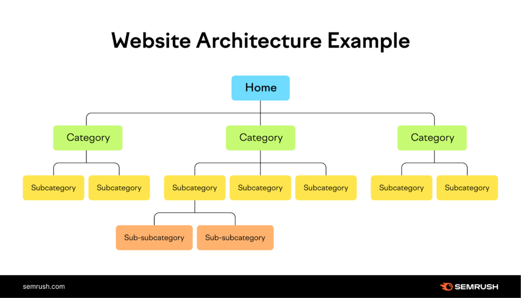
When designing a new website, organize content into a clear, hierarchical structure, starting from broad categories and narrowing down into more specific sections.
If you are planning a website redesign, first audit the content and evaluate site structure.
You want to try and keep the hierarchy shallow (ideally no more than three clicks deep) to ensure that content is easily accessible to users. You also want to group pages based on how users will interact with them, rather than internal business logic.
In the case of a website redesign, plan to consolidate pages with similar or redundant content to reduce clutter and simplify navigation.
URL structure
You want to use descriptive, human-readable URLs that reflect the page content and Include relevant keywords to improve search engine ranking.
A consistent naming pattern for all pages, and use of categories, subcategories, and tags will make it easier to organize, manage and navigate pages on the site.
If you are planning to consolidate pages to simplify site navigation, ensure that URLs of removed or consolidated pages are properly redirected (using 301 redirects) to avoid broken links and maintain SEO value.
Sitemaps
Plan to maintain an XML sitemap for search engines and an HTML sitemap for users to navigate.
Depending on your site content, you may also want to plan for a video, news (for content approved for Google News) and image sitemaps to help search engines find those content types.
Linking
In your website design plan, include a strategy for internal linking to connect related content so users and search engines can discover more content. Also plan for external (outbound) links to reputable sites.
Navigation considerations
When building a website design plan, navigational considerations ensure that visitors can find the information they seek with minimal effort.
A clear site structure helps to organize content in a logical flow, typically starting with broad categories and leading to detailed pages (e.g., Home (logo), Products, Services, About, Contact).
Menus
Consistent navigation menus, whether horizontal or vertical, create a sense of familiarity and reduce user confusion. Keep the main navigation menu simple by including no more than 5-7 main items – avoid overcrowding it with too many options.
For websites with a large number of sections or categories (e.g., e-commerce sites), use mega menus to display options in a structured, easy-to-read way. Ensure dropdowns open smoothly on hover or click, without causing confusion or accidentally closing.
Ensure that navigation elements, such as menus, buttons, and links, are easy to locate and use. This includes making sure they are responsive across devices. Consider using sticky navigation that remains visible as users scroll, so they can access the menu at any point.
Breadcrumb trails and clear call-to-action buttons can enhance user experience by offering easy ways to return to previous pages or complete desired actions.
Search
A search function is also invaluable for users who prefer a more direct route to their destination, for websites with large amounts of content or e-commerce functionality. Offer auto-suggestions to help users find what they’re looking for faster.
For sites with large catalogs, provide search filters (e.g., by price, category, date) to refine results.
Keeping the navigation of your website simple, clear, and consistent will improve the user journey, reduce bounce rates, and increase overall satisfaction.
Mobile navigation
Use a “hamburger” (three-line) menu icon for mobile devices to save space while still offering full navigation options. Use collapsible/expandable menu options for sub-navigation items to keep the mobile view clean and user-friendly.
To make your mobile navigation touch-friendly, use appropriately sized buttons and spacing.
Footer navigation
Include supplementary links in the footer for less critical but important pages, such as Privacy Policy, Terms of Service, Careers, etc.
For larger websites, the footer can serve as a mini sitemap, providing links to key sections of the site.
Call-to-actions
Ensure call-to-action (CTA) buttons (e.g., “Sign Up,” “Contact Us,” “Buy Now”) are prominently placed in both the main navigation and throughout the site to guide users toward key actions.
Use colour contrast to ensure that CTA buttons stand-out and. High contrast between the button and its surroundings increases visibility. The button should be large enough to attract attention but not so large that it overwhelms the content.
Consistency
Keep the navigation elements (menu, search bar, CTAs) in the same location on all pages for familiarity.
Keeping to conventional navigation patterns that users are familiar with to reduce the learning curve (e.g., logo on the top left linking to the homepage, navigation bar at the top or left side).
Responsive
Navigation should be responsive and intuitive across all devices, with mobile navigation adapted for smaller screens. Test for desktop, table and smartphones.
Testing
Conduct A/B testing on different navigation layouts and menu structures to determine which works best for your audience.
Heatmap tools like Hotjar are useful to understand where users click most often which will help you optimize the placement of navigation elements.
Designing wireframes
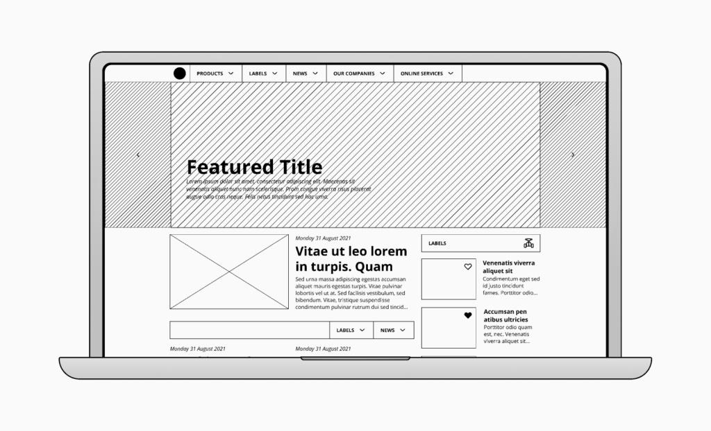
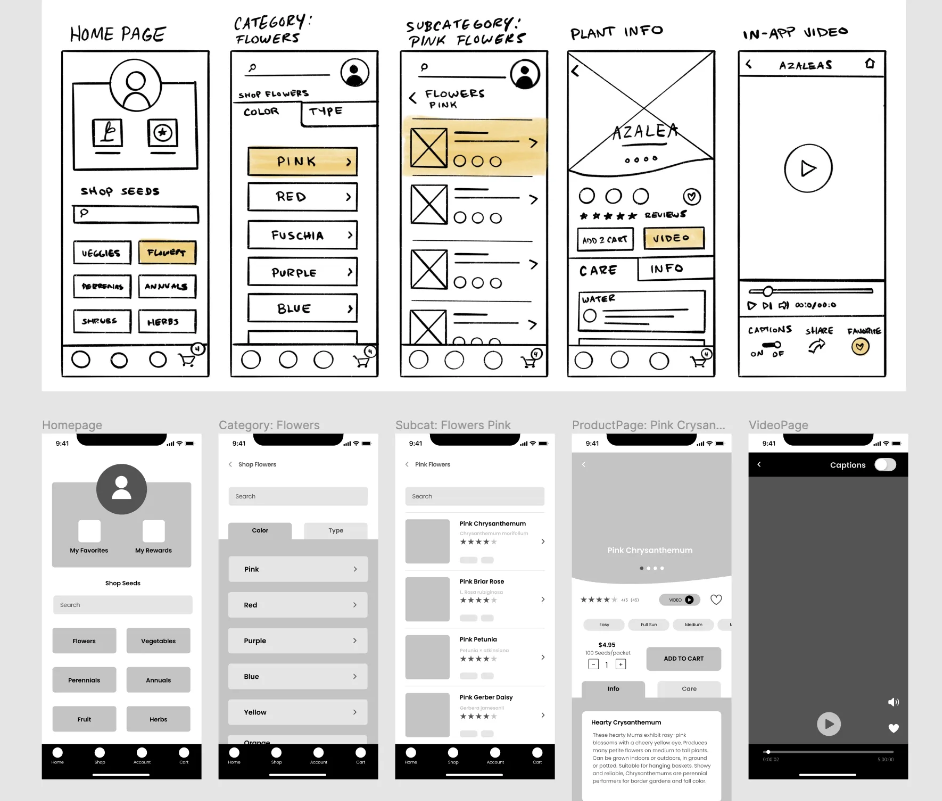
A wireframe is a visual guide that outlines the structure, content placement, and functional elements of a page or screen without focusing on design details like colors, fonts, or images.
They are typically used to define the content hierarchy, plan the user flow and navigation and organize elements such as buttons, menus, images, and text areas.
Design considerations
When building wireframes for a website design plan, they should reflect the tone of the brand (e.g., professional, fun, minimalist), meet the target audience’s needs, goals and journey and guide visitors toward important interactions.
The designs should arrange elements based on importance and key elements like headlines, call-to-action (CTA) buttons, and key content should be near the top of the page and stand out. The use of a consistent grid system will help to maintain alignment, balance, and a clean structure.
Equally important is the effective use of whitespace to reduce clutter and improve readability.
Accessibility
Plan for accessibility by ensuring that the wireframe considers color contrast, text size, and navigability for users with disabilities.
To address mobile responsiveness, create wireframes for different screen sizes and orientations, ensuring elements rearrange logically for smaller screens.
Also, consider touchpoints and interactivity for mobile users by incorporating elements like larger buttons.
Interaction design
Ensure that wireframes reflect which elements will be interactive (e.g., buttons, links) and any transitions or animations that enhance the user experience.
Consider how the design will present feedback for user actions (e.g., form submission errors, success messages) and plan for visual indicators for loading states or delayed interactions.
Tools for building wireframes
There are many tools in the market to help users build wireframes including Figma, Sketch, Adobe XD, Balsamiq Mockups, InVision, MockFlow and Wireframe.cc, to a name a few.
Each tool offers unique features depending on the depth of wireframing, prototyping, and collaboration needed.
Planning content
The content plan is another critical aspect of a website redesign plan. Remember that your content is not just the words on your website but rather the words, images, videos, infographics, whitepapers, blog posts, podcasts, and more.
Before you get started with your content plan, define the general business objectives of the website (i.e. lead generation, brand awareness, customer education), your target audience, their needs, pain points, interests, and solutions.
Once you identify the general objectives of the website, identify all your current content assets and determine what can be retained, revised, or removed.
Reviewing existing content
When reviewing content that already exists on your website:
- Determine whether the content is located in the right section (see Planning your site structure section). If necessary, move content so it is found in less than three clicks through intuitive navigation.
- Evaluate the content flow on each page to ensure that key messages are delivered effectively in a logical sequence and leads users toward key actions (see Designing wireframes section).
- Review the SEO and keyword strategy of your content by identifying keywords that should be targeted across different pages to improve organic traffic. Also review title tags, meta descriptions, header tags, image alt texts, and internal linking to ensure that they are optimized for maximum performance.
- Review to ensure that the voice, tone, and key messages are consistent across the website.
Writing new content
Once you have reviewed your existing content (or if you are starting fresh), identify new content that need to be added to the site. Things to consider when building new content:
- Establish writing guidelines like how to structure headings, subheadings, and text so content is delivered in digestible sections. Use bullet points, and short paragraphs to improve readability.
- Also establish brand voice and ensure that your tone aligns with your brand identity and resonate with your audience.
- Decide on the keywords and the intent of these that should be considered in the content of the page. Knowing these will help decide what type of content each page needs. For example, do you want someone to fill out a form, call you, read an article, watch a video, or book an appointment? Depending on the goal, you might need a special design element or technical element that should be noted.
- Consider what visual elements, such as videos, images, and interactive graphics, can be added to the site to enhance the user experience. Establish guidelines for any visual elements, like writing guidelines.
- Add testimonials or reviews to add credibility to your organization and products.
- Ensure that content formats are accessible to all users, including those with disabilities (e.g., text alternatives, transcripts for multimedia).
Content plan
When building content for your website:
- Define who will be responsible for writing, editing, reviewing and approving content.
- Create a content calendar to plan and schedule the release of new content during and after the redesign.
- Plan how existing content will be moved to the redesigned website, ensuring no loss of valuable information.
Set up 301 redirects to prevent losing search engine rankings due to any URL changes.
Once the content is launched, plan to review analytics to monitor performance. Gather insights from user data (heatmaps, surveys, interviews) to understand how visitors interact with the content.
Technical and functionality specifications
Functionality specifications for a website include the specific features, behaviours, and interactions that enhance the user experience, supports the business goals or objectives and increases visitor engagement. Here are some sample functionality specifications to consider including in your website design plan:
Content Management System (CMS)
This is backend functionality for administrators, marketers and content creators to add, edit, delete, and manage content (text, images, videos) without the need of a web developer.
There are many CMS in the market but some of the popular ones are WordPress and Wix. Look for one that is easy to use, offers multi-level approvals for content to go live, such as drafts, reviews, and publishing stages and enable plug-ins to improve the performance of your website.
CRM integration
Consider tools and plug-ins that will allow you to integrate your website with your customer relationship management (CRM) system. Examples of functionality that may be supported when your CRM and CMS are connected include:
- Ensure that lead, contact and feedback information captured on the website (e.g., through forms) is automatically synced with the CRM
- Create automated workflows that trigger follow-up emails or tasks based on user interactions on the website.
- Integrate website analytics with the CRM to track user behaviour, such as pages visited or time spent, and use this data for reporting and insights.
- Sync event registrations from the website with the CRM to manage attendee information and follow-up.
SEO management
This is backend tools and plug-ins that allows you to manage on-page optimization, technical SEO, and performance tracking. Examples of tools include Google Analytics, Google Search Console, Yoast SEO (for WordPress), and HubSpot (SEO).
User registration and authentication
Users can create accounts via email, social media, or third-party authentication systems (i.e. OAuth, Google, Facebook) so that they can access tools and assets like trial-version of tools, eLearning training, marketing presentations or partner enablement resources.
Search functionality
The ubiquity of search functionality suggests that it is each to pick a solution for your website. Unfortunately, there is varying options with varying functionality.
There are tools that offer basic search for content using keywords or phrases while others offer filtering options to refine search results based on categories, tags, or other criteria. Depending on the purpose of your website, you may also want to consider a solution that provides relevant suggestions as users enter keywords in the search bar.
WordPress plug-ins to consider include Relevanssi, Search WP, Ajax Search Pro and ElasticPress
e-Commerce
This allows users to display products or services for sale with descriptions, images, and pricing. Often solutions include shopping carts, checkout and payment gateways, and order tracking. Examples of tools include Shopify, WooCommerce, Wix eCommerce and OpenCart.
Form submissions
Visitors often request information and submit information on forms on a website. Examples include contacting the business, requesting a quote, downloading marketing materials, subscribing to a newsletter or booking an appointment.
There are many tools including Gravity forms, HubSpot, Typeform and WPforms and choosing the right one will depend on the required functionality. Make a list of what kind of information that you want to collect from visitors, where you want the information to be stored and what are the follow-up processes before making your final technology selection.
Security
Security features to consider adding to your website include SSL encryption to ensure data is transmitted securely using HTTPS, and CAPTCHA, two-factor authentication (2FA), and encrypted databases for sensitive information.
Multilingual support
For organizations that have a presence across the globe and in different languages, consider what tools will enable you to switch between different languages based on the user’s preference. You will also want to explore the ability to create translated or located content such as dynamic content translation, currency changes, and region-specific offerings.
Social media
Look for options to share content directly to social media platforms or display live feeds or posts from the company’s social media profiles.
This is just a sample of tools that need to be considered. Your business objectives for the website will help you decide if there are other tools or integrations that need to be added to your website design plan.
Design guidelines
When building the design guidelines for your website design plan, your brand’s identity and visual identity guide should be your main guide. It will provide information about your design elements, including colors, fonts, photography, and imagery. Additional design guidelines include:
- Consistency: Ensure brand and visual consistency across all pages and channels.
- Mobile-friendly: Design for mobile devices first and ensure it is responsive for different screen sizes and orientations.
- Readability: Organize content into easily scannable sections with clear headings, bullet points, and short paragraphs.
- Call to Action (CTA): Place prominent and clear CTAs to guide users towards desired actions, such as signing up or making a purchase.
- Feedback mechanisms: Provide visual or auditory feedback for user interactions, such as button clicks or form submissions
Presenting your website design plan
Presenting your website blueprint to stakeholders is essential, regardless of whether you’re in-house or agency-based.
The format of the presentation is flexible, but it’s crucial to start by explaining why the design plan exists. Re-establishing context, including the goals, ensures the team aligns on the objectives of the project, identify elements that may be missing and ensures a more successful website launch.
The design plan should reflect all the research and data collected. By presenting the blueprint as a culmination of factual findings, not opinions, you’ll likely avoid disagreements, streamline the approval process and sets a solid foundation for the next steps.
Don’t start with design
When presenting the website design plan for the first time, focus on content and functionality. Introducing design too early can shift the focus, so it’s best to save that discussion for later.
While many may focus on the homepage, the emphasis should be on pages that drive the most value for the business, ensuring visitors land on relevant pages through strong content and SEO.
If you’re redesigning an existing website, highlight significant changes to the site architecture and how they align with the project goals.
Once content and functionality requirements are agreed upon, dive into the look-and-feel discussion.
Start with lo-fi wireframes
Once you have agreement on the website design plan (or blueprint), starting with lo-fi (low-fidelity) wireframes allows stakeholders to focus on content and function rather than design.
Lo-fi wireframes work really well they don’t have to be made by a designer and allow content and function to be moved around easily.
Your lo-fi wireframes can create in a design program like Figma or Sketch, or pencil and paper sketches. Have stakeholders walk through the pages so they can better understand the customer journey.
You don’t need to create wireframes for every single page. Your key pages might be enough to give a clear understanding of how the different elements in the blueprint are visually coming together, which will help with content creation.
Start your website design plan!
As this blog shows, building or redesigning a new website can be a labour-intensive process. If you need help starting a website design plan, contact us!


