
Conversion rate optimization is said to be one of the most underused and overlooked techniques in digital marketing. But its impact cannot be understated…
It’s hard to overstate the potential financial impact of increased conversion rates on an e-commerce business.
Consider this scenario: Your website brings in $5,000,000 in revenue annually, with 1,000,000 visitors. Let’s say your conversion rate is 2%—you get 20,000 orders yearly—and your average order value is $250.
With just a half of a percentage point increase in your conversion rate (to 2.5%), you would receive 25,000 total orders each year from the same number of visitors, bringing your annual revenue up to $6,250,000—that’s more than a million dollars in additional revenue each year.
Andrew Maffettone, CEO and Founder of BlueTuskr
What is conversion rate optimization?
Often referred to as CRO, conversion rate optimization is about increasing the percentage of users or website visitors who take a desired action, like subscribing to a newsletter, filling out a form, or purchasing.
Techniques to increase conversions involve gathering data to understand how users navigate your site, interact with the content, and track their actions. Once you know a visitor’s behaviour, implement changes as part of your marketing campaign plan so you can increase the number of conversions.
CRO strategies
Several tactics can optimize conversion rate. Here are some ideas to consider for improved conversions:
Content
- Clearly articulate what you do. Have you ever gone on a website and weren’t sure what they did or even if you were on the right page? Ensuring that you clearly articulate your offering or value will help keep visitors on your site

Image source: toolset.com
- Tell them what you offer. Make it easier for your visitors to select the right product. In the Pottery Barn example below, the company listed its top categories under the primary navigation. However, you could include more about your offering and the value under the hero image.

Image source: potterybarn.com
- Build a pricing page. Pricing pages are popular, so they are great places to test your conversion optimization techniques to convert more prospects into customers. Provide information about product features for each package, pricing options (monthly or annual), specials, and how to contact your sales team. You can also use the pricing page to advertise specials or free trials to convert even more prospects.
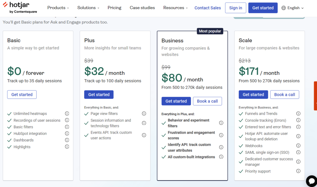
Image source: hotjar.com
Design
- Style call-to-action buttons by priority. If your webpage has two or more CTA buttons beside each other, make the background of the less important button a less noticeable colour or even transparent.

Image source: toolset.com
- Eliminate unnecessary distractions. Make it easier for the user to navigate your site and make sense of your offering. Cramming too much content (or ads) makes it harder for visitors to find what they want (and convert). Below is an example of a busy homepage from cruise.co.uk that was eye-full (they have since redesigned their site).
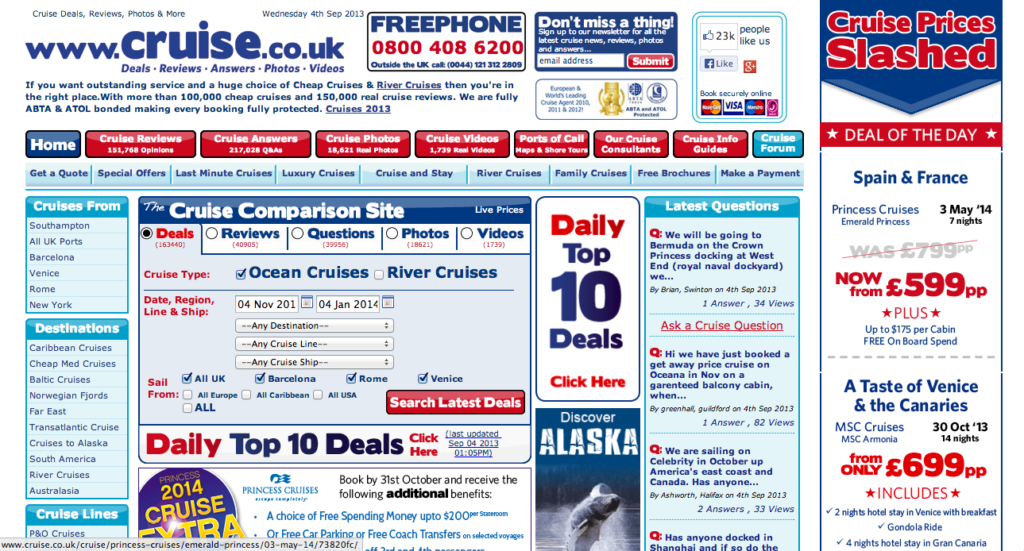
Image source: tribulant.com
Authority
- Provide social proof. Not everyone is a trailblazer. Help build confidence in your company and products by showing how many companies are using your products, the names of some of your top customers, industry awards you have won or testimonials about your company or products.
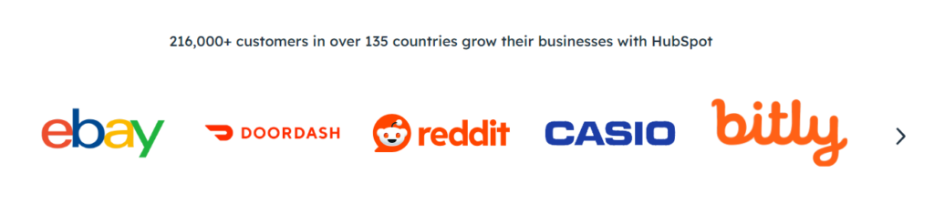
Image source: hubspot.com

Image source: hubspot.com
Entice
- Offer something for free. Almost everyone likes a sale or a discounted product. In the example below, Shopify and Zendesk offer free trials just above the fold to make it easier for prospects to get started.

Image source: shopify.com

Image source: zendesk.com
CRO101 for landing pages
Landing pages are a great way to drive specific visitors towards a particular action. However, a good landing page requires an understanding of the user journey, great design and content. Here are some tips for creating high-performing landing pages.
Content
- Compelling headline: Create a clear, attention-grabbing headline immediately communicating the value proposition. Use subheadings to elaborate on the headline.
- High-quality visuals: Choose images, videos, or graphics that support your headline. Remember to be mindful of image sizes so that they do not drastically affect page load time, which will deliver a poor visitor experience and affect your SEO performance.
- Clear Call-to-Action (CTA): Add a prominent CTA button or link that tells visitors exactly what action to take next.
- Benefits and value proposition: Develop clear content that describes the value of the offer, product or service. I like using concise bullets and, depending on the product, supporting content to elaborate on the benefits. In the example below, Zoho describes the benefits right under the hero image for maximum visibility.

Image source: zoho.com
Conversion
- Build trust: Include trust indicators like social proof elements that demonstrate trust in your products. These include customer logos, testimonials, reviews, case studies, certifications, and security badges.
- Prominent form: Opt for a short form that asks for essential information to reduce conversion friction.
- Consistent branding: For a cohesive experience, ensure your landing pages use the same colours, fonts, logos, tone of voice, and other brand characteristics.
- Mobile responsiveness: Ensure that your landing page is fully responsive and optimized for mobile devices for greater conversion.
- Contact Information: Let visitors know who to contact if they have questions or need further assistance.
Measurement
- Analytics and tracking: Implement ways to track visitor behaviour nd measure the landing page’s effectiveness.
Incorporating these elements into a landing page helps create a persuasive, user-friendly, and high-converting visitor experience.
What if I told you you could drive more sales and make more money from the website you have right now without paying for advertising, working on SEO optimizations, or posting an endless stream of social media content? That, my friend, is the beauty of CRO or conversion rate optimization. No, I don’t mean the German rapper, if you know him. Conversion rate optimization is all about improving your website to increase the percentage of visitors who complete a desired action. This action can be anything from signing up for a newsletter to downloading an ebook to completing a purchase. This last one is by far the most popular one for obvious reasons. Now, in this video, I am going to share the most fundamental conversion rate optimization tactics that you can implement on your website to start driving more conversions today. And in the end, I will also tell you the absolute most important tactic that most people miss when it comes to Chrome.
The first thing you want to do is figure out what your conversion rate actually is right now. You do this with some simple math. Let’s say in the past year, you got a thousand website visitors and had 10 sales. This means that your site’s conversion rate for that year sits at 1%. That’s the formula for conversion rate, by the way. Total number of conversions divided by the total number of website visitors multiplied by 100. Please note that you can find and track this data with any web analytics tool. Google Analytics is the most popular, but if your site runs on Shopify, Squarespace, or Wix, for example, you will also be able to access these metrics from those tools as well. If you’re new to Google Analytics, I added a link below to our GA4 course on Semrush Academy. I think you’ll like it a lot.
Okay. Back to Uppercase magazine. Is a 1% conversion rate for this website good or is it bad? It’s kind of impossible to know this unless we establish some benchmarks. With some smart Googling, you’ll find various reports that show you average conversion rates by industry or even device type. You can compare your site’s conversion rate to that and these reports to understand whether you’re doing well or not and what your conversion rate goal should be. This report by HubSpot shows conversion rate benchmarks by industry. The most relevant category here for Uppercase magazine is probably home accessories and giftware, which has a conversion rate between 1.55% and 2.34%. 1% is below this range, which means that we have room for improvement. To stay on the conservative side, I’m going to make my conversion rate goal 1.55%. By the way, I am shortcutting this process right now. You definitely want to spend more time looking at benchmark reports and your own historical data before picking conversion rate goal.
Just know that conversion rates vary across e-commerce sector. So try to find conversion rates for your specific category or industry. So now that you understand where you stand in terms of conversion rate and where you’re trying to go, it’s time to implement some CRO best practises on your site. Uppercase Magazine has a super nice homepage, but it’s missing some key elements that could help improve conversion rate. The first one is a strong H1 or main headline. An H1 is like the headline of a news story. It needs to grab attention and tell users exactly what the page is about. So keep it clear, punchy, and packed with the main keyword you are targeting with this page. When we go into Uppercase Magazine’s homepage, unless you know what this website is about, it’s kind of hard to tell. Someone who clicks through to this page might find it irrelevant, even if it’s not.
An impactful H1 right at the very top of this page could be something like quarterly magazine for the creative and curious. This simple headline would help visitors immediately understand what the site and the product is about. Now, right underneath a clear H1, it’s important to include a clickable prominent call to action or CTA. CTA buttons are like the GPS of your site directing visitors to their desired destination. So they need to be eye catching and action oriented. Use phrases like buy now, sign up today, or get your free trial. Placement is pretty crucial too, so make sure that they are kind of impossible to miss. You can think of them as the friendly nudges that guide your visitors to take an action. On the Uppercase magazine website, you have to scroll down quite far to find a call to action. So my recommendation here is to place a CTA, something like get the latest issue at the very top of this page in what we call above the fold.
The third thing that Uppercase Magazine could improve is their global navigation. These are the links that you can see up here at the very top of the page. Your navigation menu should be clear and intuitive, helping users find what they need without getting lost. So keep it simple, avoid clutter and highlight the important stuff. This navigation bar on the Uppercase magazine website could be simplified, actually quite a lot. Right now, there are too many links which can be overwhelming to users. A cleaner navigation bar with key categories such as current issue, subscribe, shop and blog would make it a lot easier for users to find exactly what they’re looking for quickly. The fourth area that Uppercase magazine could improve is their checkout process. You should always aim for a quick and painless experience. Fewer steps, guest checkout options, and a secure process are key. Now on uppercasemagazine.com, their checkout process is actually quite optimised.
You see here they have various payment options available. You can also log in and save your details so that you can check out super fast next time you buy the magazine, but I would definitely encourage them to remove some of the fields in this form. For example, the shipping and billing address checkbox could be automatically selected. That way, the form looks a lot less intimidating. Remember, every extra step is like adding another hurdle in a race and you don’t want to lose them before the finish line. Finally, recommendation number five has to do with speed. A mere, tiny one-second delay in a page load time can slash your conversion rates by as much as 7%. That sounds really dramatic, but it’s true. Users expect instant results, and if your site drags its feet, they’re going to be out of there faster than you can say loading.
So to keep your site performing at its best, you can use Semrush to conduct a site audit. I went ahead and audited Uppercase magazine and found that their site could run a lot faster if they work on their images. The audit also revealed that Uppercase magazine could reduce unused JavaScript and CSS. Removing unnecessary code can streamline the site’s performance, making it faster and more responsive. In short, a quick site not only keeps your visitors happy, but gets them to convert faster, which is a win-win. Okay. So if Uppercase Magazine implemented all of these changes that I just talked about, their homepage could look something like this. Cool, right? But even though this page contains the main pro best practises, as a marketer, you’re not done yet. Actually, you are never done. Improving your site’s conversion rate requires constant and ongoing testing. What works for one site is not going to necessarily work for another.
So try stuff, see what works and double down on that. Okay. As promised, here’s the thing that most marketers won’t tell you when it comes to CRO. You could have the most amazing, fastest, most conversion optimised website in the planet. But if your product is not appealing to your site visitors, it won’t matter. People will not buy it. Conversion rate optimization only works when you have site visitors who are actually interested in buying your products. This means that you have product market fit and/or that your marketing campaigns and channels are targeting the right buyers to come to your website.
CRO metrics
The right metrics to measure the effectiveness of CRO tactics depend on your company/product type, potential customers, where in the marketing and sales funnel the page is used, and conversion goals.
For B2C and eCommerce brands, your KPIs might include:
- session time
- average order value or revenue per visit
- cart abandonment rate
- purchase conversion rate
- customer lifetime value.
With B2B companies, your KPIs might be:
- newsletter signups
- white paper or eBook downloads
- free trial or demo signups
- sales inquiries
- sales cycle length.
Monitoring these metrics regularly, using analytics tools such as Google Analytics and Hotjar, can help you understand effectiveness and identify areas for improvement.
Get CRO help
Are you looking to improve your website’s performance? Here is a conversion rate optimization blog that will provide more tips. Better yet, let us audit your website and provide a conversion optimization plan to help you grow your business.
FAQ
CRO helps you get more value from your existing traffic. Instead of spending more on ads or SEO to attract new visitors, CRO focuses on converting more of the visitors you already have into leads or customers.
A “good” conversion rate depends on your industry, traffic source, and business model. However, many websites average between 2%–5%, while well-optimized pages can exceed 10% or more.
CRO works by analyzing user behaviour (via analytics, heatmaps, and session recordings), identifying friction points, forming hypotheses, and testing improvements through A/B testing or experimentation.
Some CRO improvements can show results within weeks, especially simple UX fixes. However, consistent and sustainable gains usually come from ongoing testing and optimization over several months.
No. CRO is valuable for any website with a goal, including B2B sites, SaaS platforms, lead-generation pages, blogs, and service-based businesses.
SEO focuses on increasing traffic from search engines, while CRO focuses on converting that traffic once it arrives. The two work best together—more traffic plus better conversions leads to stronger growth.
While higher traffic allows for faster testing, CRO can still be effective on lower-traffic sites by focusing on usability improvements, qualitative insights, and high-impact pages.